Recently, Sean McGowan was asked to summarise UX design in just one word.
Sean wrote: It felt like an exercise in futility – I have always maintained that UX design is a complicated, sometimes convoluted, amalgam of differing industries, skill sets, and disciplines.
I still do not think I have a definite answer, but there was one word I kept returning to – interaction.
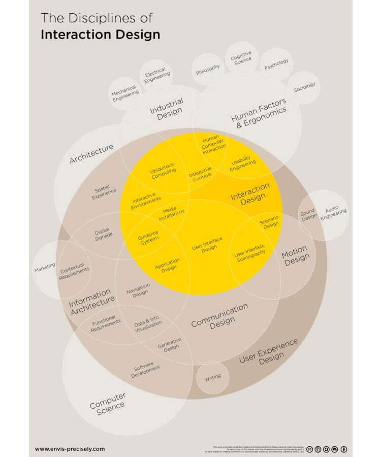
Interaction is so inextricable from a platform’s UX design that the term “interaction design” is sometimes used as a synonym (though there are some willing to argue the semantics).

Poorly designed graphic aside, interaction design is key to UX
(Image source: Interaction Design Foundation)
Too often we describe the user experience as monolithic — a seamless, fluid, uninterrupted entity. In reality, that is not the case. A user experience consists of thousands of minuscule exchanges between user and platform.
That is right: the fundamental unit of UX design is an interaction. That is why I find the word to be such an apt embodiment. So how do we create “good” interactions? If you are looking for the simplest way to do it (and as UXers, we always are), then look no further than positive reinforcement.
What Is Positive Reinforcement?
When you think positive reinforcement, you might think of Pavlov’s dogs, the famous behavioural psychology experiment. It was Pavlov who coined the term “reinforcement” after he was able to condition dogs to salivate at the ring of a bell.
I am sure you are familiar with the story. It is the archetypal story of classical conditioning, and the mechanism behind it was positive reinforcement. Pavlov rewarded his dogs with the ring of the bell and was able to form a habit (salivate) from it.
In short, positive reinforcement is only encouraging an action by rewarding it. If you mow the lawn, I will give you $20. If you hit 30k in sales, your commission rises. In short, do X and receive something good.
How Do I Use Positive Reinforcement In UX Design?
In the UX world, we can use positive reinforcement in two ways. The first, if you are employing an unconventional design feature, a non-traditional navigation, or unfamiliar architecture, you can train your users to utilise it and master it by rewarding their interaction with it.
The second, and much more widespread, application is to impose it on the platform as a whole. You are not forming a particular behaviour or habit. You simply want to encourage continued and repeated use of the website or mobile app in general.
To accomplish this, think back to interactions, the base unit of your platform. Try to positively reinforce the key ones by rewarding the user when they complete them, ultimately cultivating a more engaging, enjoyable experience.
These rewards do not have to be lavish or complicated. They may be as simple as giving the user a clear, concise confirmation that they have completed the interaction successfully.

(Image source: Quora)
Let the user know when the form they have filled out was submitted without issue. For e-commerce sites, inform shoppers that an item has been successfully added to the cart with a short animation or overlay, or let them know what stage they are at the in checkout process with a progress tracker.
Rewards in web design do not have to be fanfare or relentless, back-patting “great job”s. In UX, the best currency, and thus the best reward, is often simply information.
The Wrong Kind Of Reinforcement
It is important to discern the difference between positive reinforcement and just providing positive feedback. Do not inundate the user with pointless, saccharine pop-ups congratulating them for every action. It could come off at best annoying, and at worst condescending.
Additionally, do not refrain from informing the user when they have made a mistake. Making error messages obvious, and offering a solution, is actually positive reinforcement. Do not coddle the user. Merely point them in the right direction.
Finally, since we have spent so much time discussing positive reinforcement, I would be remiss if we did not at least address the other side of the coin: negative reinforcement. If positive reinforcement is “do X to receive something good”, its counterpart can be thought of as “do X to stop something bad”.
Negative reinforcement means that “something bad”, that consequence, is already present and affecting the user. Its removal is the motivator behind the action. And while it does work in some applications, it fails in the UX domain.
Do not purposefully sabotage the user by inserting a consequence, obstacle, or otherwise malevolent component to your experience to motivate them or change their behaviour. Users are fickle – they will immediately abandon the platform.
Conclusion
Positive reinforcement is the mechanism behind positive interactions, the building block of your user experience.
Each interaction the user makes with your platform, no matter if it is as seemingly inconsequential as typing into the search bar or a major process like onboarding, is another brick in the wall of your experience.
I am not saying you should run to your developers and have them pore over every pixel, optimising every interaction with a positive reward. But you should consider reviewing interactions in key processes like checkout, onboarding, or conversion, and optimising them with positive reinforcement.
[Source: Usability Geek – August 30, 2017, by Sean McGowan]
Call to Action:
Enrapture can review the effective UX design relative to your website and provide constructive feedback to help your site visitors get the most from your website. Contact us to discuss your website or app.


