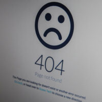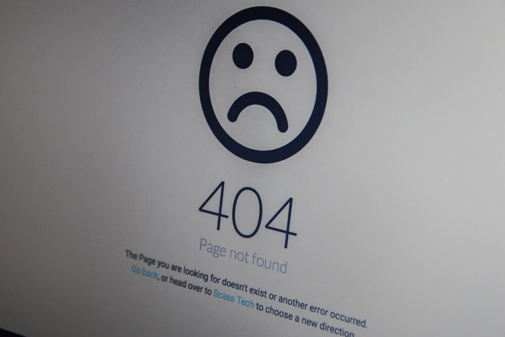
In the digital landscape, users can find it frustrating to land on a 404 error page. A 404 error indicates that the requested page could not be found, often leading to confusion and disappointment. However, a well-designed 404 error page presents a unique opportunity for brands to engage users, maintain their interest, and even turn a negative experience into a memorable one. In this article, we will explore the importance of a good 404 error page and provide insights on how to make it memorable and on-brand.
The Importance of a Good 404 Error Page
- User Experience: A 404 page is often the last line of engagement before a user decides to leave your website. A well-crafted 404 page can enhance the user experience by providing helpful information, guiding users back to relevant content, or encouraging them to explore other sections of the site.
- Brand Personality: A 404 error page offers a chance to showcase your brand’s personality. Regardless of whether your brand is fun and quirky or professional and serious, the tone and style of your 404 page can reflect this. This is an opportunity to humanize your brand and create a more relatable connection with users.
- SEO Benefits: While a 404 page indicates a broken link, it can still play a role in your site’s SEO strategy. A well-optimized 404 page can redirect users to relevant content, reduce bounce rates and improve overall site rankings.
- Encouraging Exploration: Instead of allowing users to leave your site, a creative 404 page can encourage them to explore other areas of your website. By including links to popular pages, your services, or a search bar, you can keep users engaged even when they encounter an error.
- Feedback Opportunity: A 404 page can serve as a feedback tool. By including a simple form or link to report the broken link, users can help you improve your website while also feeling valued for their input.
Designing a Memorable and On-Brand 404 Error Page
- Keep It Simple and Clear: The main goal of a 404 page is to convey the message that the requested page is unavailable. Use clear language, such as “Page Not Found” or “Oops! We can’t find that page.” Avoid complex jargon or excessive text that may further confuse users.
- Use Brand Elements: Incorporate your brand’s logo, colours, and fonts to maintain brand consistency. This helps reinforce brand identity and makes the error page feel like an integral part of your website rather than a disconnected element.
- Add a Touch of Humor: If it aligns with your brand’s voice, consider infusing humour into your 404 page. A witty message or a playful illustration can lighten the mood and make the experience less frustrating for users. For example, “Looks like you’ve taken a wrong turn! Let’s get you back on track.”
- Include Visuals: Engaging visuals can enhance the user experience. Consider using illustrations, animations, or even videos that resonate with your brand identity. Visuals can capture attention and make the page more inviting, encouraging users to stay instead of leaving.
- Provide Navigation Options: Help users find their way back by including links to popular pages, categories, or a search bar. This can be as simple as “Here are some helpful links” or “Try searching for what you’re looking for.” The goal is to guide users back into your website seamlessly.
- Mobile Responsiveness: Ensure that your 404 page is mobile-friendly. With an ever-increasing number of users browsing on mobile devices, it’s crucial that your error page looks right and functions well across different screen sizes.
- Incorporate a Call-to-Action (CTA): Encourage users to continue interacting with your website after encountering a 404 error. This could be a prompt to return to the homepage, explore popular products, or sign up for a newsletter. A good CTA can help retain user interest and guide them toward a positive next step.
- A/B Testing: Like any other aspect of your website, your 404 page can benefit from A/B testing. Experiment with different designs, messages, and layouts to see what resonates best with your audience. Collect data on user behaviour to optimize the page for better engagement.
Examples of Memorable 404 Pages
- GitHub: GitHub’s 404 page is minimalist yet effective. It features a simple message and an illustration of a cat, all while maintaining its brand aesthetic. The page also includes links to the homepage and a search bar, encouraging users to navigate back. [LINK]
- Lego: Lego’s 404 page features a playful design with a message that says, “We can’t find the page you’re looking for.” Along with a visual of scattered Lego bricks, it invites users to explore other areas of the site, reflecting the brand’s creative spirit. [LINK]
- Airbnb: Airbnb’s 404 page incorporates stunning visuals of homes and locations. The message is friendly and inviting, encouraging users to search for other properties, which aligns perfectly with their brand mission.[LINK]
- Flight Crew Risk Solutions: Flight Crew’s 404 page was kept simple, as it is an insurance website, but wanted to impart a little dry, on-brand, humour to maintain their approachable brand persona. [LINK]
- Enrapture’s own 404 page: We wanted to provide a friendly 404 page that reflected our brand, our relaxed culture. [LINK]
Takeaway
A good 404 error page is not merely a placeholder for lost web pages but a crucial touchpoint in the user journey. By transforming a frustrating experience into an engaging one, brands can retain user interest, enhance their identity, and ultimately improve their website’s overall performance. By keeping the design simple, incorporating brand elements, and providing navigation options, businesses can create a memorable and effective 404 error page that resonates with users and keeps them coming back for more.
ChatGPT. (2025). ChatGPT. https://you.com